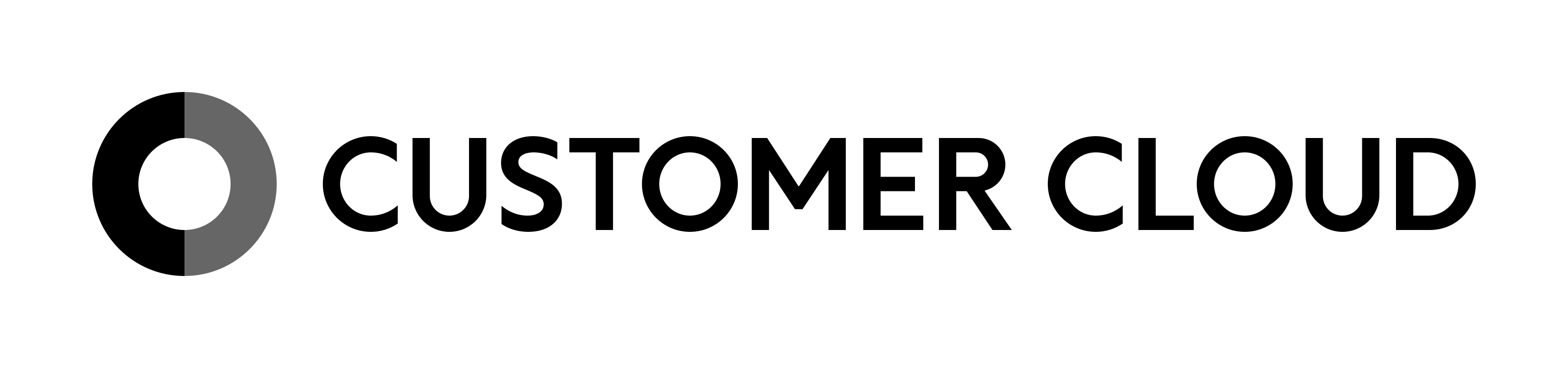
Customer Cloud Primary Logo

Brand Guidelines v1.0 / Feb. 2026

Brand.

Non-Destructive Innovation.
Not destruction, but refinement.

Every element that constitutes Customer Cloud's brand identity,
and the design philosophy behind it: the Wrap Model.

From Shibuya to the World.

Designed by Hiromi Maeo (enhanced Inc.) · Approved by Customer Cloud Corp.

The concept at Customer Cloud's foundation is "Wa" — harmony and wholeness. Rather than aiming to disrupt existing structures, we form new layers of value by enveloping them from the outside. This is our design philosophy, the "Wrap Model," and everything about our brand is derived from these three principles.

Principle 01

Wa — HARMONY

Not destruction, but refinement. We do not aim to disrupt existing structures. The history, culture, and sovereignty that a nation or organization has cultivated over a long period of time — without touching those, we form new layers of value by enveloping them from the outside. This is the "Wrap Model" design philosophy. Rather than past and future, tradition and innovation standing in opposition, we design a state in which they enhance each other's value.

Principle 02

The Aesthetics of Kurogo — KUROGO IDENTITY

Our brand identity is rooted in the concept of "Kurogo" — the black-clad stagehands of traditional Japanese performing arts. On the stage, the protagonists are always our clients: nations and enterprises. We do not put ourselves in the spotlight; we dedicate ourselves to the background, maximizing the value of the protagonists. The black foundation of our color system, our serene typography, and every aspect of our conduct are guided by this pride as Kurogo.

Principle 03

Ensuring Universality — PERMANENCE

We do not chase fleeting trends or short-term gains. Our aim is "reliability as infrastructure" that will not become outdated in 10, 20, or more years. Stripping away ornamentation and elevating the purity of meaning. Customer Cloud's design is a robust vessel for continually protecting the core of nations and enterprises, engineering enduring value that remains unshaken regardless of the era.

We never unilaterally present our own solutions. What we do first is deeply decode the "context" — our counterpart's history, values, and culture. From there, we act as a catalyst to set relationships in motion, converging dispersed elements toward a single point. CONTEXT → CATALYST → CONVERGENCE. This is the protocol for every project.

Stance 01

Decoding Context — CONTEXT

We deeply decode the "Context" — our counterpart's history, values, and culture — and present a worldview in which "this choice is the only natural one." Rather than persuasion, unearthing and articulating the right answer that already exists within the counterpart is the starting point of every project.

Stance 02

Catalyst for Change — CATALYST

Like a catalyst in a chemical reaction, we accelerate our counterpart's evolution through our very presence without changing our own essence. By never becoming the protagonist and ensuring that our counterpart remains center stage, we drive greater outcomes. We function quietly as infrastructure.

Stance 03

Convergence of Value — CONVERGENCE

We converge dispersed elements toward a single point. Technology, philosophy, markets, culture — we organize intricately intertwined elements and guide them to a state where decision-making becomes possible. We find order from chaos and elevate complex challenges into simple structures.

Two axes always coexist in Customer Cloud's business. Customer is immutable, and Cloud is mutable. In the value we deliver, the gravity of Valuation (asset value) and the agility of Speed coexist simultaneously. This duality is not a contradiction but the very operating principle of providing "things that keep changing" in order to protect "things that must never change."

The Wrap Model — Concentric Diagram of the Three-Layer Structure A concentric diagram with the Core (the client's sanctuary) at the center, Customer Cloud in the middle layer, and the Wrap as a protective boundary on the outer ring L1 Core L3 / Wrap Outer Ring — Protective Boundary L2 / Customer Cloud Strategy Layer — Supporting the Core The client is always the protagonist
THE WRAP MODEL / THREE LAYERS — Core (Client's Sanctuary) / Customer Cloud (Strategy Layer) / Wrap (Protective Boundary)
L1

The Client's "Sanctuary (Core)"

Sovereignty, founding spirit, history. An immutable domain that must never be touched. The white circle at the center represents the client's essence, untainted by anything.

L2

Customer Cloud

The layer that supports the Core through concepts and strategy, and serves as the interface with the outside. It stands between the Core and the outer shell, mediating the relationship between the two.

L3

Wrap (Outer Ring)

The protective boundary that envelops the Core. The outermost shell that wraps around the Core without directly touching it. All business operations are conducted upon this Wrap.

The Customer Cloud Brand Umbrella is a structure in which business operations are organized in two tiers beneath the corporate (umbrella) level: the Concept & Strategy Layer and the Implementation Layer. Domain color application is determined based on this hierarchy. Since the Concept & Strategy Layer is not confined to a specific domain, it is expressed using corporate colors.

Hierarchy and Applied Colors

TierBusiness DomainApplied Color
Corporate (Umbrella) Customer Cloud Overall Corporate Colors (Black + Dark Gray + White)
Concept & Strategy Layer National Strategy Domain
National Intelligence Domain
Corporate Colors (no domain-specific color)
Implementation Layer AI Domain Sky Blue / #0095C8
Finance Domain Royal Blue / #2856A3
Urban Development Domain Coral Orange / #E8734A
Environment Domain Emerald Green / #079173

The Customer Cloud symbol condenses the core philosophy — "Not destruction, but refinement. (The Wrap Model)" — into a single form. The white circle at the center represents the "Core" — the client's sanctuary — and two C-shapes envelop this Core from both sides. They are simultaneously the initials of the company name "Customer Cloud" and a visualization of the very entity that protects the client's core.

Full Color Left C: Black (#000000) / Right C: Dark Gray (#666666) / Core: White
Monochrome Left & Right C: Black (#000000) / Center Dividing Line: White / For monochrome media

Management Perspective

The left C represents Valuation (immutable asset value), and the right C represents Speed (mutable execution velocity).

Company Name Perspective

The left C represents Customer, and the right C represents Cloud. A cloud that envelops and supports the client.

Internal Perspective

The left C represents the Sanctuary (Core), and the right C represents the Wrap (Extension). Protect the Core, extend outward.

Three-Layer Structure

L1

Layer 1 — Core (Center White Circle)

The sanctuary that must be protected for the client. Always rendered in white, it never changes under any circumstances. The untainted white is a declaration that the client's essence is inviolable.

L2

Layer 2 — Two C's (Customer Cloud)

Two C-shapes that envelop the Core from both sides. They are Customer Cloud itself — the entity that protects and supports the client. The left C is always black; the right C is Dark Gray in corporate expression and changes to each domain color in domain expression.

L3

Layer 3 — Outer Ring (Wrap)

The outer circumference formed by the two C's. As the layer (Wrap) that envelops the Core, it constitutes the outer shell. The black of the left C represents the immutable foundation as "Kurogo," while the variable color of the right C expresses adaptation to the business context.

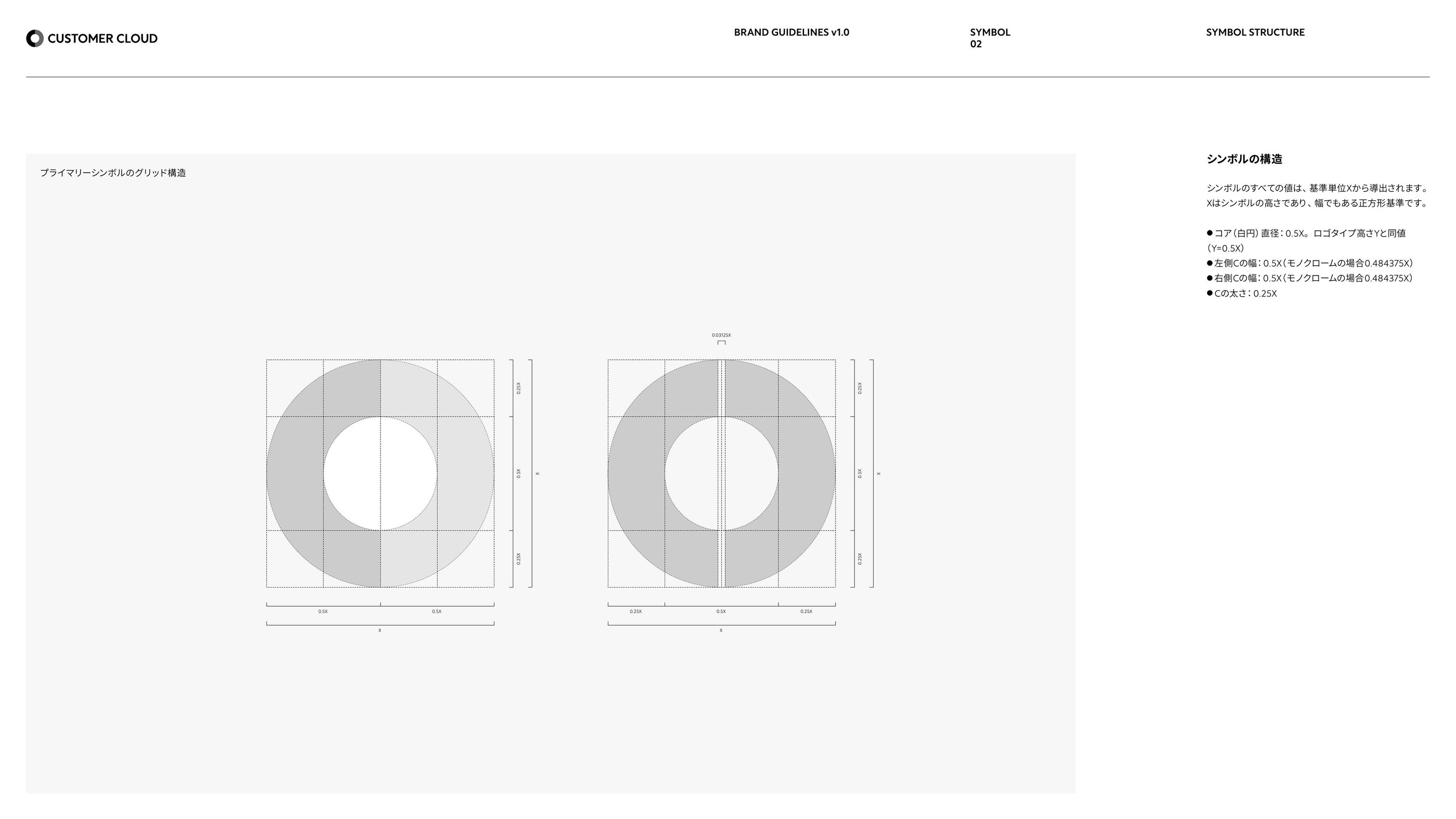
All values of the symbol are derived from the base unit X (symbol height = width). X is based on a square, and every element — Core, C-shapes, dividing line, and clear space — is defined as a ratio of X.

Symbol grid structure and proportions — X-based
Symbol grid structure (Left: Full Color / Right: Monochrome)

Dimension System (X-based)

Symbol construction numerical specifications
ElementValueNotes
Base UnitXSymbol height = width. Square-based
Core (White Circle) Diameter0.5XEqual to logotype height Y (Y=0.5X)
Left C Width0.5X0.484375X for Monochrome
Right C Width0.5X0.484375X for Monochrome
C Thickness0.25X
Monochrome Dividing Line Width0.03125X
Clear Space0.5XAll sides. No text, graphics, or other logos may be placed within

Minimum Size for Standalone Symbol Use

Standalone symbol use is limited to favicons, social media avatars, app icons, and environments where brand recognition is well established. The values below represent the absolute minimum sizes for standalone symbol use. For the minimum size of the logo (symbol + logotype), refer to "11 Minimum Size."

VariationDigitalPrint
Full Color Symbol (Standalone)16 px4 mm
Monochrome Symbol (Standalone)32 px5 mm

Small-Size Specific Rules

For extremely small media such as favicons and social media avatars, the clear space rule (0.5X) does not apply; follow each platform's safe area guidelines instead. Prioritize visibility above all else.

MediumSpecification
FaviconSVG (recommended) / ICO 64×64 / PNG 192×192
Social Media AvatarBased on unit Z: symbol width 0.6Z / margin 0.2Z

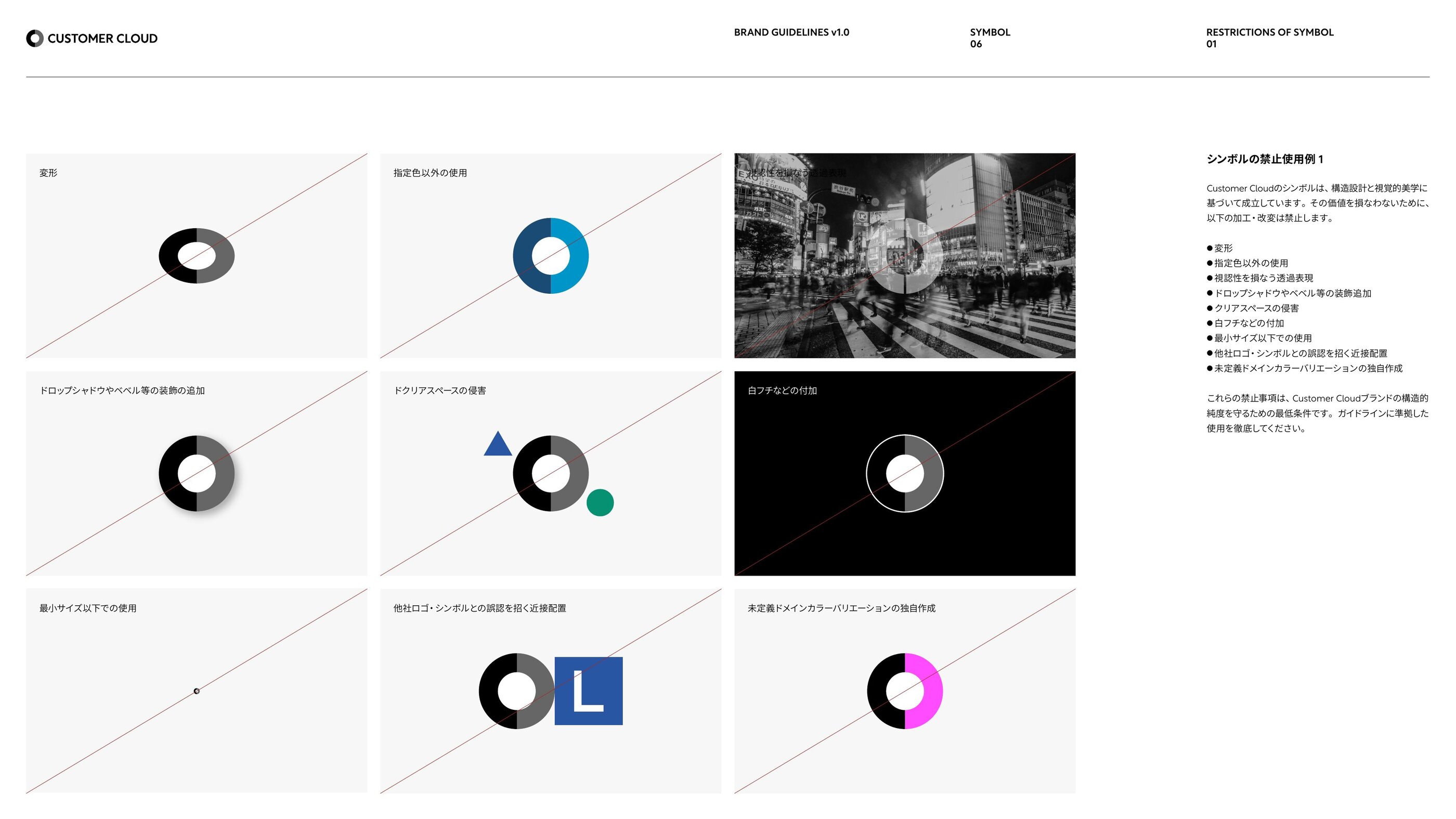
The Customer Cloud symbol is established based on structural design and visual aesthetics. To preserve its value, the following modifications and alterations are strictly prohibited.

Prohibited uses of the symbol — distortion / added decoration / loss of visibility
Prohibited uses of the symbol — distortion, added decoration, loss of visibility, etc.

12 Prohibited Practices

  1. Distortion
  2. Use of non-specified colors
  3. Transparency that compromises visibility
  4. Adding decorations such as drop shadows or bevels
  5. Encroachment on clear space
  6. Adding white borders or outlines
  7. Use below the minimum size
  8. Proximity placement that could cause confusion with other logos or symbols
  9. Unauthorized creation of undefined domain color variations
  10. Use on background colors that hinder visibility
  11. Use on complex background designs
  12. Use of the symbol within body text

The logotype "CUSTOMER CLOUD" adopts Rustica Medium from Adobe Fonts as its base font, with letterforms adjusted according to a precise numerical system. A typeface that suppresses individuality, stands quietly, and never says more than necessary. Customer Cloud exists as "Kurogo" standing beside the client, and a distinctive font was intentionally avoided to prevent strengthening visual assertion.

Dimension System (X-based)

ElementValueNotes
Cap Height (Logotype Height)Y = 0.5XEqual to Core diameter
Stem Weight (Vertical Stroke Thickness)A = 0.09375X
Crossbar Weight (Horizontal Stroke Thickness)B = 0.078125X
Word SpaceC = 0.195X
Diagonal Angle124°Diagonal of R / N

Notation Rules

The logotype must always be written as "CUSTOMER CLOUD" (all uppercase + space). customer cloud (all lowercase), Customer Cloud (title case), CustomerCloud (no space), and CUSTOMERCLOUD (no space) are all incorrect.

Select the appropriate logo variation based on the background lightness when using the logo. WCAG 2.1 SC 1.4.11 (graphic elements at 3.0:1 or above) is applied as an internal standard.

Background LightnessRecommended Logo
Lightness 80–100 (White to Light Gray)Full Color or Monochrome (Black)
Lightness 60–79 (Light Mid-Gray)Monochrome (Black) recommended
Lightness 40–59 (Dark Mid-Gray)Monochrome (White / Reverse) recommended
Lightness 0–39 (Dark Gray to Black)Use Monochrome (White / Reverse)
Domain Color BackgroundUse White / Reverse due to insufficient contrast with the right C
Photo / Image BackgroundPlace a semi-transparent panel behind the logo to ensure contrast

All logo variations have a defined absolute minimum size to guarantee visibility, and a clear space of 0.5X that must be maintained around the logo. Use below the minimum size and placement of elements within the clear space are prohibited.

Logo Minimum Sizes (Complete)

VariationDigitalPrint
Full Color Primary (Horizontal)120 px30 mm
Full Color Stacked A100 px25 mm
Full Color Stacked B100 px25 mm
Monochrome Primary240 px37.5 mm
Monochrome Stacked A100 px25 mm
Monochrome Stacked B100 px25 mm

Clear Space (Isolation)

0.5X in all directions (X = symbol height). No elements whatsoever — text, graphics, photographs, rules, other logos, etc. — may be placed within this zone. This also applies to page edges and bleed lines.

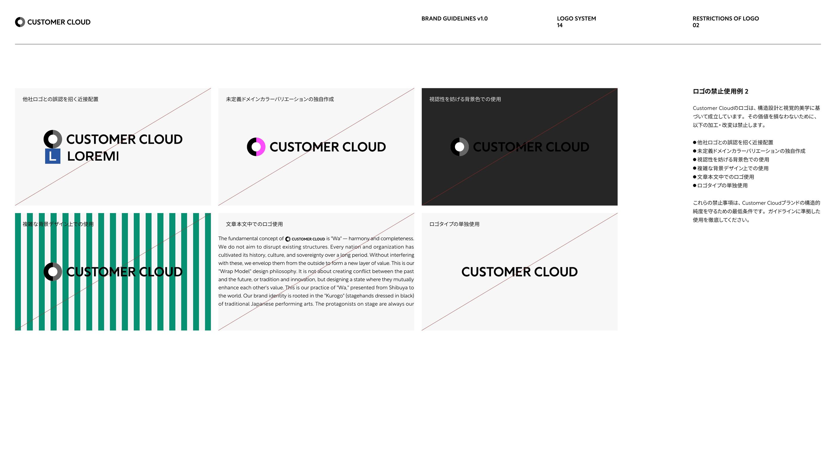
As an integrated unit of symbol and logotype, the logo has its own constraints in addition to the 12 symbol prohibitions. All 15 items below must be observed.

Prohibited uses of the logo — proximity to other logos / standalone logotype use / use within text
Prohibited uses of the logo — proximity to other logos, standalone logotype use, use within text, etc.

15 Prohibited Practices

  1. Distortion
  2. Changing margins between elements
  3. Use of non-specified colors
  4. Transparency that compromises visibility
  5. Adding decorations such as drop shadows or bevels
  6. Substituting the typeface
  7. Encroachment on clear space
  8. Adding white borders or outlines
  9. Use below the minimum size
  10. Proximity placement that could cause confusion with other logos
  11. Unauthorized creation of undefined domain color variations
  12. Use on background colors that hinder visibility
  13. Use on complex background designs
  14. Use of the logo within body text
  15. Standalone use of the logotype (must always be paired with the symbol)

The corporate colors consist of three colors: Black, Dark Gray, and White. Based on the Kurogo aesthetic, they are restrained base tones that suppress assertion. Four domain colors are deployed supplementally for each business domain. Additionally, three functional colors are defined exclusively for UI information communication.

Corporate Colors

Black
Black
#000000 / RGB 0,0,0 / CMYK 0/0/0/100 / Pantone Process Black C

The base tone. A background color that highlights the protagonist, based on the Kurogo aesthetic. WCAG contrast ratio 21:1 (AAA). Used for the left C of the symbol, logotype, body text, and headings.

Dark Gray
Dark Gray
#666666 / RGB 102,102,102 / CMYK 0/0/0/75 / Pantone Cool Gray 10 C

The supplementary color in corporate expression. As the standard color for the right C of the symbol, it differentiates left from right through the lightness difference with black. Contrast ratio 5.74:1 (AA).

White
White
#FFFFFF / RGB 255,255,255 / CMYK 0/0/0/0

The client's sanctuary. The untainted white is a declaration that the client's essence is inviolable. Used for the Core (symbol center circle) and reverse logo.

Domain Colors

Sky Blue
Sky Blue / AI / AI
#0095C8 / RGB 0,149,200 / CMYK 81/25/9/0 / Pantone 639 C

The flow of intelligence. The trajectory of intellect flowing through a vast ocean of data, expressed in the clear blue of the sky. Transparency — a visual declaration of the "intelligence that respects the client's core" that Customer Cloud's AI business aspires to.

Royal Blue
Royal Blue / Finance
#2856A3 / RGB 40,86,163 / CMYK 92/73/1/1 / Pantone 7685 C

The depth of trust. The financial endeavors that underpin a nation's economic foundation, expressed in azure. Not surface brilliance, but reliability as unwavering as the deep sea — the color of "the transparent layer for sovereignty" embodied by Customer Cloud's finance business.

Coral Orange
Coral Orange / Urban Development
#E8734A / RGB 232,115,74 / CMYK 4/71/80/0 / Pantone 4011 C

The pulse of the earth. The activities of people flowing through cities, the warmth of the land, expressed in a coral-like warm tone. Rather than demolishing and rebuilding, we layer upon what already exists, reflecting the organic pulse of the city as color.

Emerald Green
Emerald Green / Environment
#079173 / RGB 7,145,115 / CMYK 84/21/71/0 / Pantone 7724 C

The cycle of life. The enduring activities of life and the cycles of nature, expressed in jade green. Even with human intervention, the power of nature itself remains undiminished — the color of the domain where the Wrap Model philosophy is communicated most intuitively.

Domain Color Expansion Example — Sky Blue (AI)

Each domain color interpolates Shades (S-) and Tints (T-) in HSL color space, centered on the base color (S-100%). They are used for UI tonal expression, data visualization, interaction states (hover / active), and other purposes as appropriate. Below is an expansion example based on Sky Blue (#0095C8).

S-100%#000000
S-90%#000E13
S-80%#001D27
S-70%#002C3C
S-60%#003B50
S-50%#004A64
S-40%#005978
S-30%#00688C
S-20%#0077A0
S-10%#0086B4
BASE#0095C8
T-10%#0DACE7
T-20%#07BFFE
T-30%#26C7FF
T-40%#44CFFF
T-50%#63D7FF
T-60%#83DFFF
T-70%#A2E7FF
T-80%#C1EFFF
T-90%#E0F7FF
T-100%#FFFFFF

* Shades (S-) interpolate toward black, and Tints (T-) interpolate toward white. Each expanded color is a reference value for UI implementation; adjustments based on display environment and print conditions are recommended before use.
Functional Colors (UI Information Communication Only)

Functional colors are used exclusively for UI information communication. They are prohibited for brand expression (application to symbol, logo, or taglines is forbidden), and fade/shade expressions are also prohibited.

RoleNameHEX / RGB / CMYKUsage
Success Success Green #166834 / RGB 22,104,52
CMYK 89/43/98/16
UI success indicators, completion notifications
Info Info Blue #194B75 / RGB 25,75,117
CMYK 95/72/28/26
Information display, supplementary explanations
Error Alert Red #A32828 / RGB 163,40,40
CMYK 30/98/97/12
UI error display, warnings, alerts

Color Usage Rules

  • Left C: Always black (full color logo only)
  • Right C: Corporate = Dark Gray, Domain = corresponding domain color
  • Core: Always white (full color logo only)
  • Logotype: Light background = black, dark background = white
  • When in doubt, default to corporate expression
  • Avoid mixing domain colors within the same medium
  • The Concept & Strategy Layer (National Strategy / National Intelligence Domain) is not confined to a specific domain, therefore corporate colors are used

Customer Cloud's identity functions not only as a static logo but also as a dynamic expression. The symbol's shape, left C, and Core are always invariant; only the right C (domain color) and background (dynamic expression corresponding to the domain) change. "The clear separation of the immutable and the mutable" is the essence of Customer Cloud's dynamic identity.

Invariant

What Never Changes

Symbol shape / left C (black) / Core (white) / perfect circle form. Invariant elements that visualize the operating principle: "The client is always the protagonist."

Variable

What Keeps Changing

Right C color (corporate / each domain color) / background dynamic expression (3 related colors based on the domain color's primary hue).

Boundary

Constraints on Dynamic Expression

Dynamic elements are limited to behind the symbol only. May only be used on light backgrounds with lightness of 40% or above. Dynamic range must remain within +10-15% of symbol diameter. Three or more rapid successive switches per second are prohibited (photosensitive seizure prevention).

Fundamental Principles

  • May only be used with the full color logo
  • May only be deployed on light backgrounds (background density 40% / #999999 as the darkness floor; dark and black backgrounds are prohibited)
  • The symbol must always remain static (rotation, movement, scaling, shape distortion, and circumference fragmentation are prohibited)
  • Only the background moves (dynamic elements unfold behind the symbol and never appear in front)
  • The three-layer structure must always be maintained (left C, right C, and Core must be clearly visible)
  • The perfect circle must always be maintained (distortion into ellipses or polygons is prohibited)

Rustica from Adobe Fonts is used for Latin text, and Source Han Sans Japanese for Japanese text. We have chosen typefaces that suppress individuality, stand quietly, and never say more than necessary. Customer Cloud's stance as "Kurogo" standing beside the client is reflected in the typeface selection as well.

Latin — Rustica

CUSTOMER CLOUD

Japanese — Source Han Sans

From Shibuya to the World.

Composite Fonts

NameUsageLatinJapanese
CC_RBody textRustica LightSource Han Sans Normal
CC_MHeadingsRustica RegularSource Han Sans Medium
CC_BEmphasis / HeadingsRustica MediumSource Han Sans Bold

Minimum Size (Accessibility)

UsageDigitalPrint
Body Text14 px or above7 pt or above
Captions12 px or above5 pt or above

A tagline condenses the brand's intent into a single line of words. If the symbol speaks through form, the tagline speaks through language. It is deployed in three tiers: Primary / Corporate Sub / Domain Sub, and English is always used for brand expression (Japanese translations may only be used as explanatory text within sentences).

Primary From Shibuya to the World. — Origin and aspiration

From Shibuya to the World.

Corporate Sub Non-Destructive Innovation. — Unique operating principle

Non-Destructive Innovation.

AI Sub Intelligence that respects your core.

Intelligence that Respects Your Core.

National Strategy Sub Architecture for the next millennium.

Architecture for the Next Millennium.

National Intelligence Sub Decode context. Define the core.

Decode Context. Define the Core.

Finance Sub The invisible layer for sovereignty.

The Invisible Layer for Sovereignty.

Urban / Environment Sub Building on what already exists.

Building on What Already Exists.

* Use of multiple taglines within a single medium is prohibited. Application of domain colors to taglines is also prohibited (domain colors may only be used for backgrounds and surrounding elements).

Brand name notation differs depending on context: logo, body text, or formal corporate name. Incorrect notation undermines brand consistency; always follow the official notation below.

ContextCorrect NotationProhibited Notation
Logo Notation CUSTOMER CLOUD
(all uppercase + space)
customer cloud / Customer Cloud / CustomerCloud / CUSTOMERCLOUD
Body Text Notation Customer Cloud (English) CC (abbreviation) used in body text
Formal Corporate Name Customer Cloud Corp. Cloud Customer Corp. (incorrect word order)
Tagline (English) Non-Destructive Innovation.
(title case)
Using translated taglines as brand expression

Customer Cloud's brand identity was reconstructed as part of a new corporate brand system announced in February 2026. With "Not destruction, but refinement. (Non-Destructive Innovation)" as its central philosophy, it was designed in collaboration with Hiromi Maeo of enhanced Inc., a Tokyo-based international branding studio.

CUSTOMER CLOUD BRAND GUIDELINES v1.0 / Feb. 2026
CUSTOMER CLOUD BRAND GUIDELINES v1.0 / Feb. 2026 — Cover
Japan is home to a wealth of outstanding talent that can compete on the world stage. Yet it is also true that the "vessel" to connect them is not yet fully in place. From Shibuya to the World. Japan's AI industry is about to enter another "exciting era." As a catalyst for that transformation, Customer Cloud has begun to move.
Representative Director & CEO Hiroshi Kinoshita
Version

CUSTOMER CLOUD BRAND GUIDELINES v1.0 — Published February 2026

Designer

Hiromi Maeo / enhanced Inc. — A VI / logo / brand design studio fusing Japanese aesthetic sensibility with a global market perspective

Approved by

Customer Cloud Corp.

Governance

If questions arise regarding these guidelines, or if a case occurs that is not covered herein, please consult the brand administrator.

Brand Resource Request

Brand Asset Inquiries

For the use of Customer Cloud brand assets — including the logo, symbol, and taglines — within the scope of these guidelines, we accept individual consultations. If you are considering the use of brand assets for press coverage, joint ventures, or other purposes, please submit an overview of your intended use through our Contact form. We will review your request and provide further guidance.

Go to Contact Form