

Customer Cloud Corp. has announced its new corporate logo. The logo symbolizes the philosophy of “enriching without destroying (Non-Destructive Innovation),” and aims to establish a brand identity that fuses Japanese aesthetics with a global perspective.
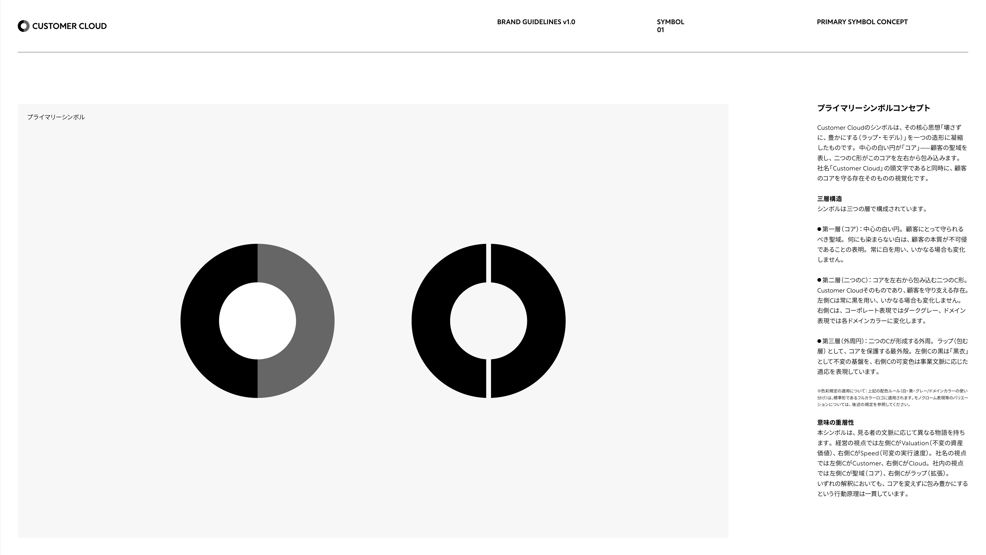
Visualizing the “Wrap Model” in Three Layers
The logo design consists of three layers. The white circle at the center represents the client's core (the sanctuary), and around it wrap the two Cs, the initials of Customer Cloud. This visualizes the “Wrap Model,” which layers value on top of the core rather than destroying it.
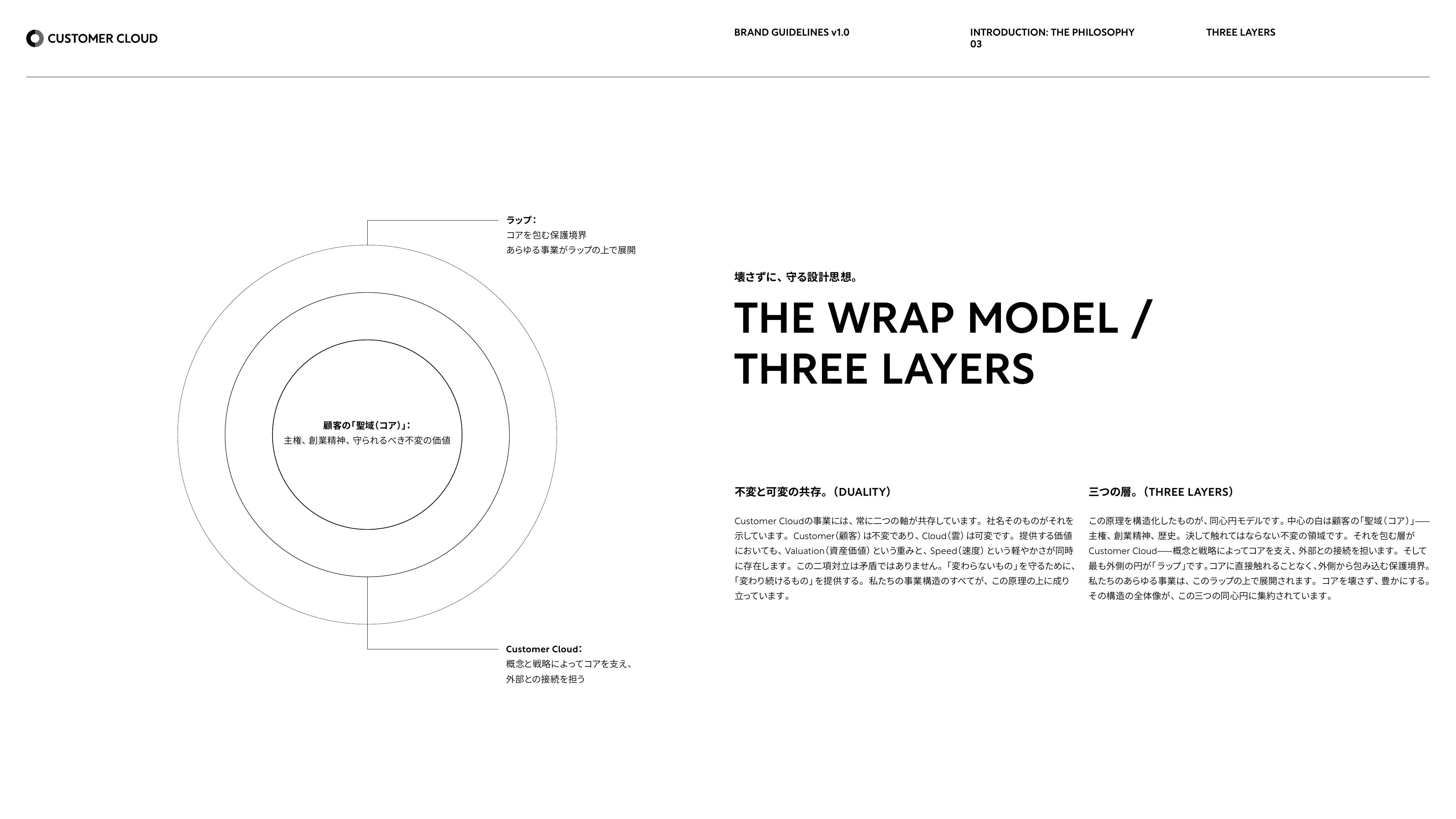
A Color Design That Shows a “Continuous Relationship” Through Tone Alone, Without a Dividing Line
In the color design, the left C (black) represents the unchanging foundation and the right C (dark gray) the changeable domain. By using only differences in tone, without a dividing line, the design shows a continuous relationship rather than a division. The logo is designed as a dynamic identity, allowing its colors and expression to change for each business area.
The client is always the protagonist.
Customer Cloud chooses the aesthetic of the “kurogo,” who supports the protagonist on stage.
The Aesthetic of the “Kurogo” — Supporting the Protagonist
The aesthetic of the “kurogo” expresses the philosophy of staying in the background as the one who supports the protagonist on stage. Customer Cloud exists to bring out the client's brand most fully, and the color design expresses its guiding principle: “The client is always the protagonist.”
From Shibuya to the World: Non-Destructive Innovation
The new brand is being rolled out with the tagline “From Shibuya to the World. Non-Destructive Innovation.” In contrast to Silicon Valley-style disruptive creation, it stands for creating value while respecting the core of cultures, nations, and companies. The company is promoting the “Second Bit Valley Initiative” to connect Japan's AI industry to global markets, aiming to build a new industrial ecosystem that links AI talent, companies, technology, and communities.
Details of the new logo and the brand system are available on the Customer Cloud Brand Guidelines page.